Year12 Media Studies
Thursday, 3 April 2014
Friday, 14 March 2014
Evaluation
Question 1 - In what ways does your media product use, develop or challenge forms and conventions of real media products?
Our product meets conventions as the victim is female, which is often used in crime programs, thrillers and horror films. Also the murderer is very masculine which is also a common convention and clichéd. However, the murderer in our film is female (although she is shown in a very masculine way). This challenges conventions as the antagonist is often male. The plot of this opening meets conventions as it is often used (victim being chased through a wooded area). Overall, our product, including the soundtrack and casting, is very clichéd as it is based strongly around existing texts. It both meets and challenges stereotypes.
Question 2 - How does your media product represent particular social groups?
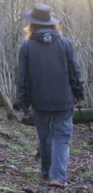
The main social group that it represented in our project is females. The protagonist in our film meets the stereotypes as she is a 'helpless female'. However, the antagonist is female too, which challenges this stereotype, although she is shown in a very male way. Detective Dave would be the main protagonist in the rest of this film. This meets stereotypes as he is male.
Question 3 - What kind of media institution might distribute your media product and why?
Our product would be distributed by a small-scale, independent company as it is not high budget and not made by a well-known company (TNC). It could be shown in the London Short Film Festival or other such events.
Question 4 - Who would be the audience for your media product?
Question 5 - How did you attract/address your audience?
Question 6 - What have you learnt about technologies from the process of constructing this product?
Question 7 - Looking back at your preliminary task, what do you feel you have learnt in the progression from it to your full product?
Our product meets conventions as the victim is female, which is often used in crime programs, thrillers and horror films. Also the murderer is very masculine which is also a common convention and clichéd. However, the murderer in our film is female (although she is shown in a very masculine way). This challenges conventions as the antagonist is often male. The plot of this opening meets conventions as it is often used (victim being chased through a wooded area). Overall, our product, including the soundtrack and casting, is very clichéd as it is based strongly around existing texts. It both meets and challenges stereotypes.
Question 2 - How does your media product represent particular social groups?

The main social group that it represented in our project is females. The protagonist in our film meets the stereotypes as she is a 'helpless female'. However, the antagonist is female too, which challenges this stereotype, although she is shown in a very male way. Detective Dave would be the main protagonist in the rest of this film. This meets stereotypes as he is male.
Our product would be distributed by a small-scale, independent company as it is not high budget and not made by a well-known company (TNC). It could be shown in the London Short Film Festival or other such events.
Question 4 - Who would be the audience for your media product?
Question 5 - How did you attract/address your audience?
Question 6 - What have you learnt about technologies from the process of constructing this product?
Question 7 - Looking back at your preliminary task, what do you feel you have learnt in the progression from it to your full product?
Thursday, 13 March 2014
Revised plot summary
There were a lot of minor changes made to our original plan. In our original storyboard, we had two victims. However, when it came to filming, we could not arrange a suitable actress for the second victim. Therefore, we changed the plot slightly for one victim. Also the positioning of the murderer was too hard to arrange with minimal personnel. We therefore had to imply the murder, instead of showing it.
As we could not get hold of the necessary props and equipment, the pathologist scene had to be simplified. This means that it lost a lot of it's meaning but we used different shots to rectify this. In addition, the murder weapon had to change as we didn't have a big enough axe. As we had a sickle, we used that instead.
As we had only minimal personnel at our disposal, a lot of the planned shots had to be change. For example, we had planned to use over the shoulder shots from the murderer. However this proved to not be feasible. This reduced the amount of shots we used so we used longer shots to fill in the time.
Some of the shots had been too ambitious for our budget and ability. For example, we couldn't do any of the planned tracking shots as we didn't have a dolly and the cheapest ones we could find were £400 or so. We attempted to improvise with carts but it looked too messy and unprofessional.
Shots of our Product
Most our product is made up of longer, long to medium range shots. This means that we can show the victim running and the murderer pursuing in the same short. This provides a concept of time and space. There are very few close ups of the characters, which means that they remain anonymous. However, this means that there are few reaction shots, which means there is very little emotion to our characters.
We put a fairly unnoticeable jump cut in one of the scenes where the murderer is pursuing the victim, to imply a mysterious aura to the murderer. However, this is not vital to the story line, so we didn't make it pronounced. We also put a jump cut between the final scenes, to imply the passing of time and make our antagonist appear superior, or god-like.
We used a handheld camera shot in order to make the audience feel uneasy. It also made it feel authentic, as if the footage was genuine. In addition, it makes it seem like the victim is being watched by some unknown observer, as if the shot is from their point of view.
The shots in the chase sequence get closer to the victim, which gives the impression of something closing in. The last shot in that sequence was an extreme close up of the victim, when the gradual build up of tension has reached it's peak. This is the point at which the audience feels most involved.
If we'd had the time and equipment, we would have used a greater range of shots. For example, we would have used more jump cuts and fast paced editing to provide the feeling of a chase. We also would have used a panning or panoramic shot to show the murder scene in the last shots.
Wednesday, 12 March 2014
Mise en scene of our Product
The costumes of our characters were fairly casual. We felt that to make this more realistic and relatable to our audience, we needed our victim to be like them and the murderer to be someone they could believe to be real. Therefore, our victim is wearing casual clothing (jeans and a hoodie) and our murderer is wearing jeans and a jacket. We felt that the hat would provide some level of anonymity. This would create an uneasy feeling around the identity of the killer and add intrigue to the plot.
The entrails we used, we thought had to be real to add a realistic feeling to the scene. We therefore, spoke to local butchers in our area and were supplied with pig guts (tongue, lungs and heart). However the blood was fake, as we needed blood but could not be readily supplied with it.
Also we used liquid latex to make the wound in the victim's head. We felt this would show a level of professionalism, as it is used in actual films.
We didn't use many props in our film as most of it was the victim running away. The only main prop we used the sickle that the murderer had. We felt that this was an appropriate weapon as it could inflict damage but wasn't an unrealistic choice; the look of the sickle suggested this thought. Also the shape of the sickle is similar to a scythe, which carries connotations of death.
We also had a mobile phone as a prop, held by Detective Dave, however this proved to be of little importance in the actual film.
Originally when we first filmed, we had more props (a mobile phone and a music box). We thought the phone would be realistic as it would show how the victim had tried to get help. The music box was playing creepy music and we felt this would add to the atmosphere of the shot. However we could not get these shots to fit into the plot so we left them out.
Ideally we would have used more props, such as police tape or pathology suits to make the meaning of the final scene clearer to the audience. However, we couldn't get hold of any of these in time for our filming (or legally).
Tuesday, 11 February 2014
Soundtrack Research
We are looking at how we can make suitable ominous music for our soundtrack. We looked at soundtracks from other thrillers and horror movies, in order to gain insight into what type of music they have:
28 Days Later -> http://www.youtube.com/watch?v=DbwlGv9SWfY
Dead Silence -> http://www.youtube.com/watch?v=hio1fHy_3HM
The Ring -> http://www.youtube.com/watch?v=ARANSQ15Vrk
Halloween -> http://www.youtube.com/watch?v=iP-jYiuDD9g
Saw -> http://www.youtube.com/watch?v=vhSHXGM7kgE
Paranormal Activity -> http://www.youtube.com/watch?v=jaqa6u3xgqo
We found that these soundtracks suited our requirements and they fitted the mood of our main opening scene. These also inspired us into researching new techniques and sounds using certain software such as 'Garageband' in order to create our own soundtrack in a similar style:
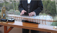
We found techniques that creates the right sort of sound we wanted. For example, the eerie/ethereal noise effect from a Glass Armonica but with wine glasses:
http://www.youtube.com/watch?v=kzJC1ENMdeI
 http://www.youtube.com/watch?v=XKRj-T4l-e8
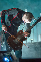
Also, there is playing guitar with a violin or e-bow based on the band Sigur Rós, as played by Jónsi Birgisson:
http://www.youtube.com/watch?v=531JCuZZ4pw
http://www.youtube.com/watch?v=kQsPv4FMyLg
28 Days Later -> http://www.youtube.com/watch?v=DbwlGv9SWfY
Dead Silence -> http://www.youtube.com/watch?v=hio1fHy_3HM
The Ring -> http://www.youtube.com/watch?v=ARANSQ15Vrk
Halloween -> http://www.youtube.com/watch?v=iP-jYiuDD9g
Saw -> http://www.youtube.com/watch?v=vhSHXGM7kgE
Paranormal Activity -> http://www.youtube.com/watch?v=jaqa6u3xgqo
We found that these soundtracks suited our requirements and they fitted the mood of our main opening scene. These also inspired us into researching new techniques and sounds using certain software such as 'Garageband' in order to create our own soundtrack in a similar style:

We found techniques that creates the right sort of sound we wanted. For example, the eerie/ethereal noise effect from a Glass Armonica but with wine glasses:
http://www.youtube.com/watch?v=kzJC1ENMdeI
 http://www.youtube.com/watch?v=XKRj-T4l-e8
Also, there is playing guitar with a violin or e-bow based on the band Sigur Rós, as played by Jónsi Birgisson:
http://www.youtube.com/watch?v=531JCuZZ4pw
http://www.youtube.com/watch?v=kQsPv4FMyLg
We used 'Garage Band' in order to make our original recordings sound eerie/menacing. We also used this to construct our soundtrack.
Title
We looked at the titles of other horror films and saw they mostly had simple titles, with hidden meanings connoting the visceral or scary nature of the film. For example, Final Destination, which is a title that could be used in a film about a journey. However, in this case the final destination is death.
This title is written in a handwritten style and looks either scratched or written in liquid. The design is very plain and simple. The colour scheme is black and white an this could follow the classic horror movie style. It provides a mysterious bleak feeling.
All the letters are block capital and some look cut, suggesting the use of a weapon. The blood splatters show the visceral nature of the film. The colour scheme is mainly basic black and white but the red of HOUSE is a violent contrast and matches the blood.
The font on this title looks engraved and could suggest a more demonic theme to the film, liked to pagan worship. Also the spikes or horns on the letters carries connotations of the devil.
This title again has a very simple colour scheme and style. The way the letters are joined could suggest movement and links to the actual title. Also, the reflections/ shadows in the background are pointy and sharp, suggesting weapons or visceral deaths.
We have decided to call out film The Berserk.
Development of the title style:
This is how we developed our title idea to reach our target audience and portray the genre in the typography.
Friday, 17 January 2014
Location
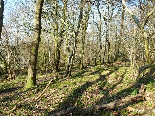
We have decided that our favoured location for shooting the main shots in the film opening is Duncliffe Wood as it meets the characteristics of our location in the film. If we need to then we will discuss with the council or national trust for permission to use the area for filming.
We are hoping it will snow for our filming.
We are hoping it will snow for our filming.
Actor Profiles
Sam Parker:
Violet Williams:
Hannah would be good person to play Sam Parker as she has acting experience and is capable of expressing feeling through movement. Her appearance also fits what we want our character to look like.
Faye would be good for this character because she has a good work ethic and can stay in character due to this. She would also be able to express the emotions this character would feel.
Violet Williams:
Clair would have this part because she is good at portraying emotion and thoughts through facial expressions.
Kerry would fit this role because she look like the character we had in mind. She's also determined to do well and can be focused on the task at hand. She also has experience of horror films and thrillers.
Murderous Murderer:
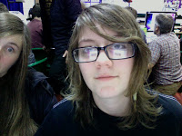 Sophie Smith:
Sophie would fit this role because, through body language, she can portray feelings such as threat and menace.
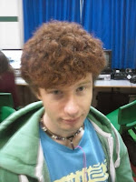
James Hazzard:
James would be a good murderer because of his manner and he has good presence.
Detective Dave:
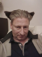 Michael Surtees:
He has the same mysterious and menacing characteristics fit for the character. He is also well-spoken and can keep serious in role.
Dog Walker - Eve:
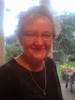 Sarah Surtees:
She would fit this role because she fits the requirements of the character (owns a dog). She can also fill the emotional requirements. As a parent, she can add emotions that a single or childless woman my not be able to bring.
Murderous Murderer:
 Sophie Smith:
 Sophie would fit this role because, through body language, she can portray feelings such as threat and menace.

James Hazzard:
James would be a good murderer because of his manner and he has good presence.
Detective Dave:
 Michael Surtees:
He has the same mysterious and menacing characteristics fit for the character. He is also well-spoken and can keep serious in role.
Dog Walker - Eve:
 Sarah Surtees:
She would fit this role because she fits the requirements of the character (owns a dog). She can also fill the emotional requirements. As a parent, she can add emotions that a single or childless woman my not be able to bring.
Friday, 13 December 2013
Film Cover Design Research
We researched and looked at different horror film dvd covers and decided to use the aspects we likes about them and apply them to our own cover idea.
The way the writing is arranged around the photos and nothing overlaps means it's not too intense and difficult to read. Also the eye of the bird stands out as it is the only part in colour. This suggests that the danger comes from the birds and links to the title.
It's very simple and made of geometric shapes and block colours which makes it stand out more. However. none of the lines are level, which, like a handheld camera in filming, would suggest a panicked situation and fear. The blacks and reds are typical of a horror film.
The typography is easy to read and is cleverly used combined with the background image. The O merges into the eye but also has a foggy silhouette of a man. Also, none of the lines are definitive, but smudged and blurred. This adds intrigue and links to the title imagery of a hollow man.
The face fades into the background, giving it an mysterious effect. The lighting is very intense on the face. The use of two screaming mouths as eyes initially makes the face look alien, unnatural or supernatural and also shows the fear in the film. The smile on their face also suggests metal instability and makes you want to find out what they do.
The spotlight effect on the central image and the black background focuses your eye on it. The darkness also adds mystery. The subject is hard to make out as they are sat down with their back to the camera. Also, the picture is out of context and this adds to the Primacy effect and makes the audience want to watch the film.
The eyes of the girl on the cover stares out directly at you. This draws the audience in as it directly addresses you. Also her lack of a mouth provides the feeling of helplessness and adds intrigue. The figures at the bottom of the cover are hard to identify and they're anonymity adds interest to the film.
The key is symbolic and connotes a relationship between the key and the plot, making us want to find out the connection. It also uses a combination of mundane pictures (hotel room) and darker, expected pictures (dark front cover).
The shattered effect on the face symbolises death and quickly provides the audience with a visual portrayal of the genre. This is also shown but the bottom half of the face being a skull. There is a black void behind the glass, which the skull is coming out of or going into. This links to the connotations of death.
The silhouette of the people shows their pain and the glass door signifies being trapped. The glass used is similar to that of labs or hospitals, which suggests experimentation or misuse of power.
The monochromatic colour scheme gives it a vintage, classic effect, but also shows the atmosphere of the story. The man on the front is clearly panicked and trying to get away from something. The figures in the background suggest that he is trapped.
The girl in the foreground shows helplessness but the face in the background shows the intensity of the situation portrayed. Also the lighting used, which is dark and tinted sepia, adds to the atmosphere of the film.
On our cover we will use a combination of desirable aspects of these cover designs, and merging them into one super rad cover. We will use a ghostly effect on a human face and push our colour scheme towards the ones on these covers. We will use black, white and red as these are the most popular colours used.
This is an example of how we are planning to show the face:
We made this by photocopying our face in black and white.
Monday, 9 December 2013
BBFC Classification
The British Board of Film Classification decides what rating a film is, from U to R18, based on the content of the film. We will rate our film as a 15 as it contains mild gore and threat and easily accessible weapons are used.
Friday, 6 December 2013
Production and Distribution
To help us decide on what we want our production company to be like and to make it seem more professional we have researched current major film production companies:
These are major film company logos. They follow a basic pattern of a clear, simple title and epic backgrounds. This focuses the attention onto the company name. They generally use geometric shapes such as circles.


.jpg)

Here is our main idea for a logo for our production company idea based on our research:
Our logo takes the idea of having a clear company name and the design idea of Metro Goldwyn Mayor and Summit Entertainment as they have plain backgrounds.
The production of our film is a fairly low budget as the equipment and software used is fairly basic and cheap.
Most films are distributed through cinema screenings, DVD, Blu-ray, VHS and VCD or downloading/streaming from the internet. They would normally be advertised through media such as posters, magazines, newspaper articles, trailers on the internet and television.
These are major film company logos. They follow a basic pattern of a clear, simple title and epic backgrounds. This focuses the attention onto the company name. They generally use geometric shapes such as circles.


.jpg)


Here is our main idea for a logo for our production company idea based on our research:
The production of our film is a fairly low budget as the equipment and software used is fairly basic and cheap.
Most films are distributed through cinema screenings, DVD, Blu-ray, VHS and VCD or downloading/streaming from the internet. They would normally be advertised through media such as posters, magazines, newspaper articles, trailers on the internet and television.
Tuesday, 3 December 2013
Storyboard
This is our storyboard of our film opening. Camera movements are indicated by red arrows. Actor movements are indicated by blue arrows.
Thursday, 28 November 2013
THE preliminary project
And………here it is:
This is really bad quality and we're not sure why. The quality was quite good when we made it :/ As it's only our preliminary and we don't get marks for it anyway we thought it didn't matter all that much. It also varied a bit from the outline.
This is really bad quality and we're not sure why. The quality was quite good when we made it :/ As it's only our preliminary and we don't get marks for it anyway we thought it didn't matter all that much. It also varied a bit from the outline.
Wednesday, 27 November 2013
Development of Preliminary
From the basic outline, we knew we needed someone walking down a corridor, going through a door and talking to someone.
As we are doing a horror/ thriller for our finished product. we thought it would be best to do a similar genre for our preliminary. This would allow us to experiment with shots and other techniques used in filming to convey the atmospheric feelings of tension and suspense.
Instead of walking down a corridor, the character is walking home, although she does walk down her corridor inside the house. Going through the door could either be through the front door or her bedroom door and instead of talking, we felt a single, scream would be more appropriate.
We filmed at dusk/night because this would create the necessary atmosphere and lighting. We thought this was vital to the mise en scene of our preliminary.
We chose Kerry Pike to be the victim as she appears vulnerable and represents the classic stereotype.
Our murderer does not appear in the filming, which provides a mysterious, ominous atmosphere, coupled with the diagetic heavy breathing. We thought that to convincingly not show the murderer, we needed to use a handheld camera, to portray the murderer's point of view.
Tuesday, 26 November 2013
Preliminary plan summary
In our preliminary project, we will follow the outline closely (someone walks down a corridor, through a door and talks to someone). We will film it at Hannah's house because there are multiple set options. We would also have a range of actors to choose from.
The story for our preliminary is that a girl comes home from [school?] and is being stalked by a murderous murderer. She goes into her house and into her room. As she closes the door we hear her scream. This is where it will end.
The story for our preliminary is that a girl comes home from [school?] and is being stalked by a murderous murderer. She goes into her house and into her room. As she closes the door we hear her scream. This is where it will end.
Friday, 22 November 2013
Film opening research
We studied and made notes on a variety of different film openings to see what aspects of them we want in ours. This would help us appeal to our target audience.
In the opening of Australia, there is voice-over narration to give background to the main characters and story and show life through his eyes. It also positions us on his side and we automatically dislike the antagonist even though we haven't met him yet, through the murder of Maitland Ashley. In addition, as this happens right at the beginning, it adds intrigue to the storyline as his killer is unknown.
All music in this opening is non-diegetic and adds atmosphere. All other sound is diegetic except the voice-over narration.
In the opening of this film, it immediately dives into the action, which makes us anticipate the rest of the film and adds intrigue, as we don't know what happens to the characters. However, it is similar to the other two films. This makes the storyline predictable as the story unravels. On the other hand, there are some twists which make it interesting.
The use of non-diegetic music adds suspense and alerts the viewer to the fact something is about to happen.
In the opening of One Missed Call, the camera is tracking along where we view a derelict wall and
dark windows and the non-diegetic music is ominous which created suspense and as it slows down and zooms in on one of the windows so we expect something to make us jump so we automatically feel nervous and after the scream it cuts to the next scene which is action packed, and we are forced to relate the opening scene to this scene thus we want to understand more about the story line and make sense of it so we want to watch more.
In the opening of this film, we are immediately introduced to the main character. We are also positioned with him as he is injured. As the opening continues, we are drawn more and more to this character as he continues in his plight to keep his leg. The music also adds to this as it builds atmosphere. It is non-diegetic and reflects the emotions in this opening.
In the opening of Australia, there is voice-over narration to give background to the main characters and story and show life through his eyes. It also positions us on his side and we automatically dislike the antagonist even though we haven't met him yet, through the murder of Maitland Ashley. In addition, as this happens right at the beginning, it adds intrigue to the storyline as his killer is unknown.
All music in this opening is non-diegetic and adds atmosphere. All other sound is diegetic except the voice-over narration.
In the opening of this film, it immediately dives into the action, which makes us anticipate the rest of the film and adds intrigue, as we don't know what happens to the characters. However, it is similar to the other two films. This makes the storyline predictable as the story unravels. On the other hand, there are some twists which make it interesting.
The use of non-diegetic music adds suspense and alerts the viewer to the fact something is about to happen.
In the opening of One Missed Call, the camera is tracking along where we view a derelict wall and
In the opening of this film, we are immediately introduced to the main character. We are also positioned with him as he is injured. As the opening continues, we are drawn more and more to this character as he continues in his plight to keep his leg. The music also adds to this as it builds atmosphere. It is non-diegetic and reflects the emotions in this opening.
Sunday, 17 November 2013
Questionnaire results analysis
We have gathered the results from our questionnaire and put them into graphs in order to make analysis and evaluation easier:
Everyone said that they would pay an average around £10 for a new film. A few people said the would spend up to £15.
In the openings of films, our audience said they looked for the Primacy effect, action, good music and an introduction to the main characters. They also thought it was important to have a good plot, realistic characters and a suitable location.
Our most popular film openings from our audience were Star Trek, Cabin in the Woods, Skyfall and Goodfellas. As most of these are Action/Adventure we would base our film on this. However this would be hard to do with our budget and time limit. We will, therefore, do a Thriller instead as it also includes the main features our audience thought important.
Friday, 15 November 2013
Questionnaire
We have made a questionnaire to gather information about our audiences media consumption habits to determine what sort of target audience we are aiming our film opening project at. This is our questionnaire:
We are planning to distribute it around our school amongst the teachers and students by emailing a variety of age groups plus printing of a few to hand out to people. We will use the filled questionnaires to gather a range of information from throughout the year groups, then use it to plan our project and expand on our knowledge of our target audience.
Subscribe to:
Comments (Atom)


