Tuesday, 11 February 2014

Soundtrack Research

We are looking at how we can make suitable ominous music for our soundtrack. We looked at soundtracks from other thrillers and horror movies, in order to gain insight into what type of music they have:

28 Days Later -> http://www.youtube.com/watch?v=DbwlGv9SWfY
Dead Silence -> http://www.youtube.com/watch?v=hio1fHy_3HM
The Ring -> http://www.youtube.com/watch?v=ARANSQ15Vrk
Halloween -> http://www.youtube.com/watch?v=iP-jYiuDD9g
Saw -> http://www.youtube.com/watch?v=vhSHXGM7kgE
Paranormal Activity -> http://www.youtube.com/watch?v=jaqa6u3xgqo

We found that these soundtracks suited our requirements and they fitted the mood of our main opening scene. These also inspired us into researching new techniques and sounds using certain software such as 'Garageband' in order to create our own soundtrack in a similar style:
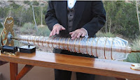


We found techniques that creates the right sort of sound we wanted. For example, the eerie/ethereal noise effect from a Glass Armonica but with wine glasses:

http://www.youtube.com/watch?v=kzJC1ENMdeI
http://www.youtube.com/watch?v=XKRj-T4l-e8

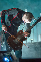
 Also, there is playing guitar with a violin or e-bow based on the band Sigur Rós, as played by Jónsi Birgisson:

http://www.youtube.com/watch?v=531JCuZZ4pw

http://www.youtube.com/watch?v=kQsPv4FMyLg

We used 'Garage Band' in order to make our original recordings sound eerie/menacing. We also used this to construct our soundtrack.


Title

We looked at the titles of other horror films and saw they mostly had simple titles, with hidden meanings connoting the visceral or scary nature of the film. For example, Final Destination, which is a title that could be used in a film about a journey. However, in this case the final destination is death.

 This title is written in a handwritten style and looks either scratched or written in liquid. The design is very plain and simple. The colour scheme is black and white an this could follow the classic horror movie style. It provides a mysterious bleak feeling.

 All the letters are block capital and some look cut, suggesting the use of a weapon. The blood splatters show the visceral nature of the film. The colour scheme is mainly basic black and white but the red of HOUSE is a violent contrast and matches the blood.

 The font on this title looks engraved and could suggest a more demonic theme to the film, liked to pagan worship. Also the spikes or horns on the letters carries connotations of the devil.

This title again has a very simple colour scheme and style. The way the letters are joined could suggest movement and links to the actual title. Also, the reflections/ shadows in the background are pointy and sharp, suggesting weapons or visceral deaths.

We have decided to call out film The Berserk.

Development of the title style:

 
This is how we developed our title idea to reach our target audience and portray the genre in the typography.